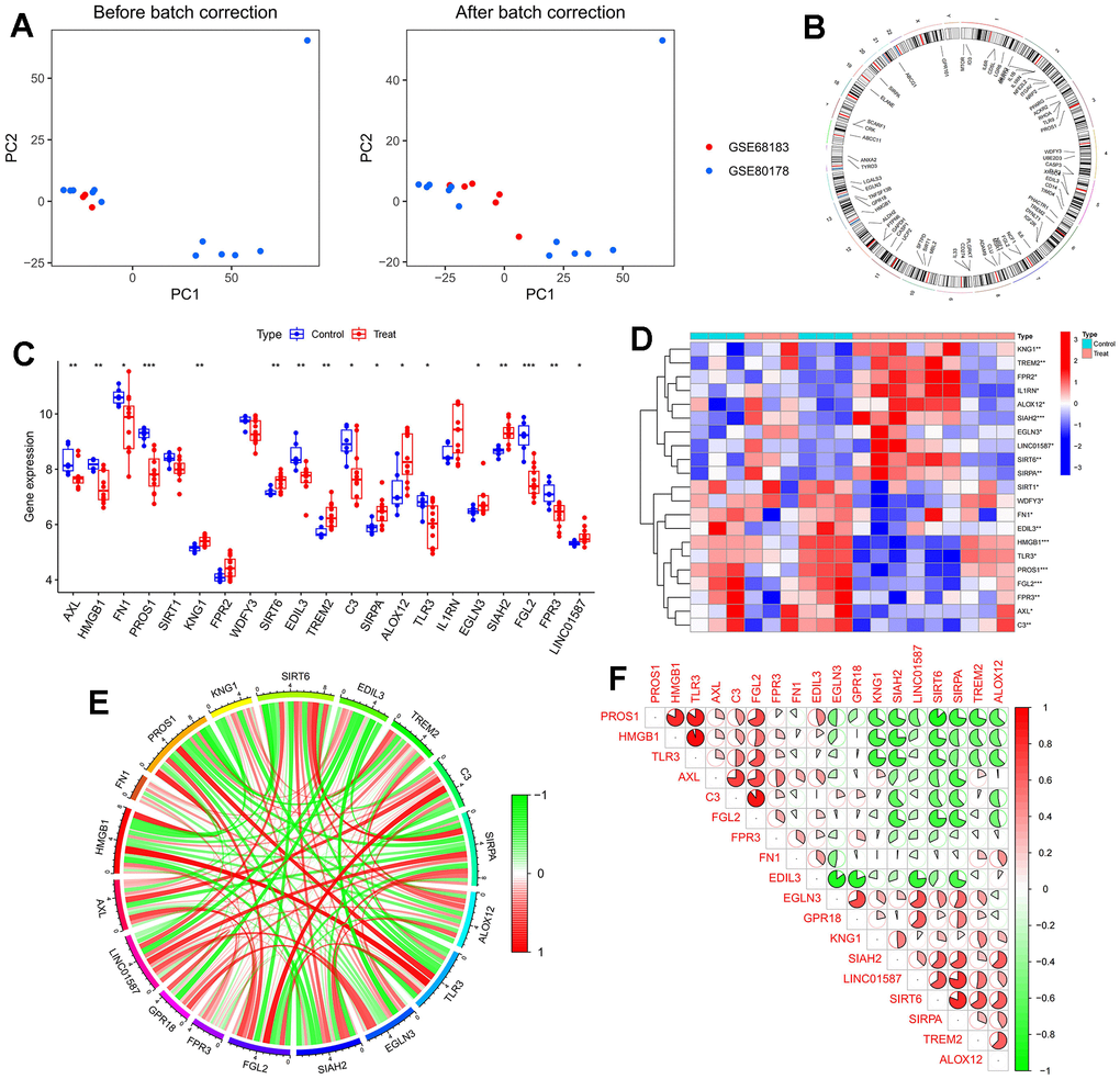
Figure 2.Dataset preprocessing and difference analysis. (A) Principal component analysis (PCA) analysis before batch effect removal; (B) Heatmap of deGlnMRG; (C) The location of MERGs on chromosomes; (D) The expression levels of MERGs; (E) Gene relationship network diagram of deMERGs; (F) Correlation analysis of deMERGs. Red and green colors represent positive and negative correlations, respectively. The correlation coefficient was expressed as the area of the pie chart.