Submit an Article
Navigate
Home
Editorial Board
Editorial Policies
Current Volume
Archive
Scientific Integrity
Publication Ethics Statements
Interviews with Outstanding Authors
Newsroom
Sponsored Conferences
Podcast
Contact
Special Collections
Submit an Article
Online ISSN: 1945-4589
Research Paper
|
Volume 12, Issue 11
|
pp. 10317–10336
Nomogram for the prediction of diabetic nephropathy risk among patients with type 2 diabetes mellitus based on a questionnaire and biochemical indicators: a retrospective study
Back to article
Figure 5
(5 of 9)
−
100%
+
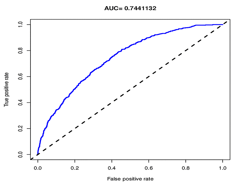
Figure 5.
The pooled AUC of the ROC curve.
The y-axis means the true positive rate of the risk prediction. The x-axis means the false positive rate of the risk prediction. The blue line represents the performance of the nomogram.