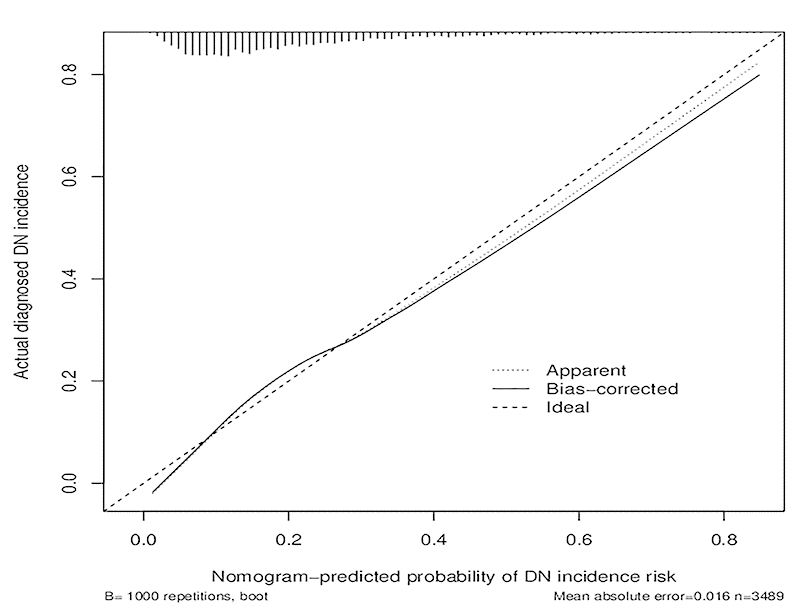
Figure 4.Calibration curves of the DN incidence risk nomogram prediction in the cohort. The x-axis represents the predicted DN incidence risk. The y-axis represents the actual diagnosed DN. The diagonal dotted line represents a perfect prediction by an ideal model. The solid line represents the performance of the nomogram, of which a closer fit to the diagonal dotted line represents a better prediction.